Kungsörnen Prima – Design concept and packaging explorations.
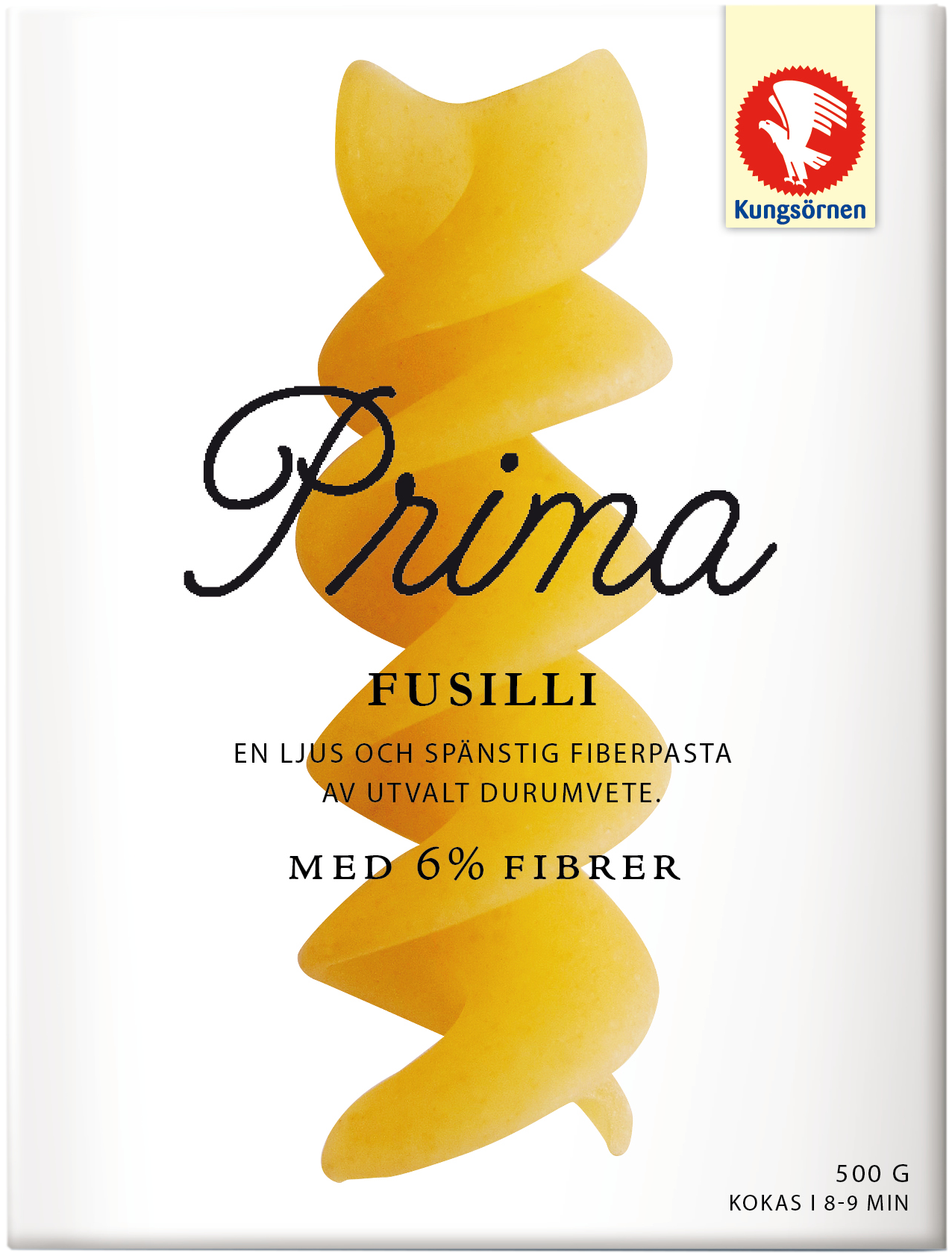
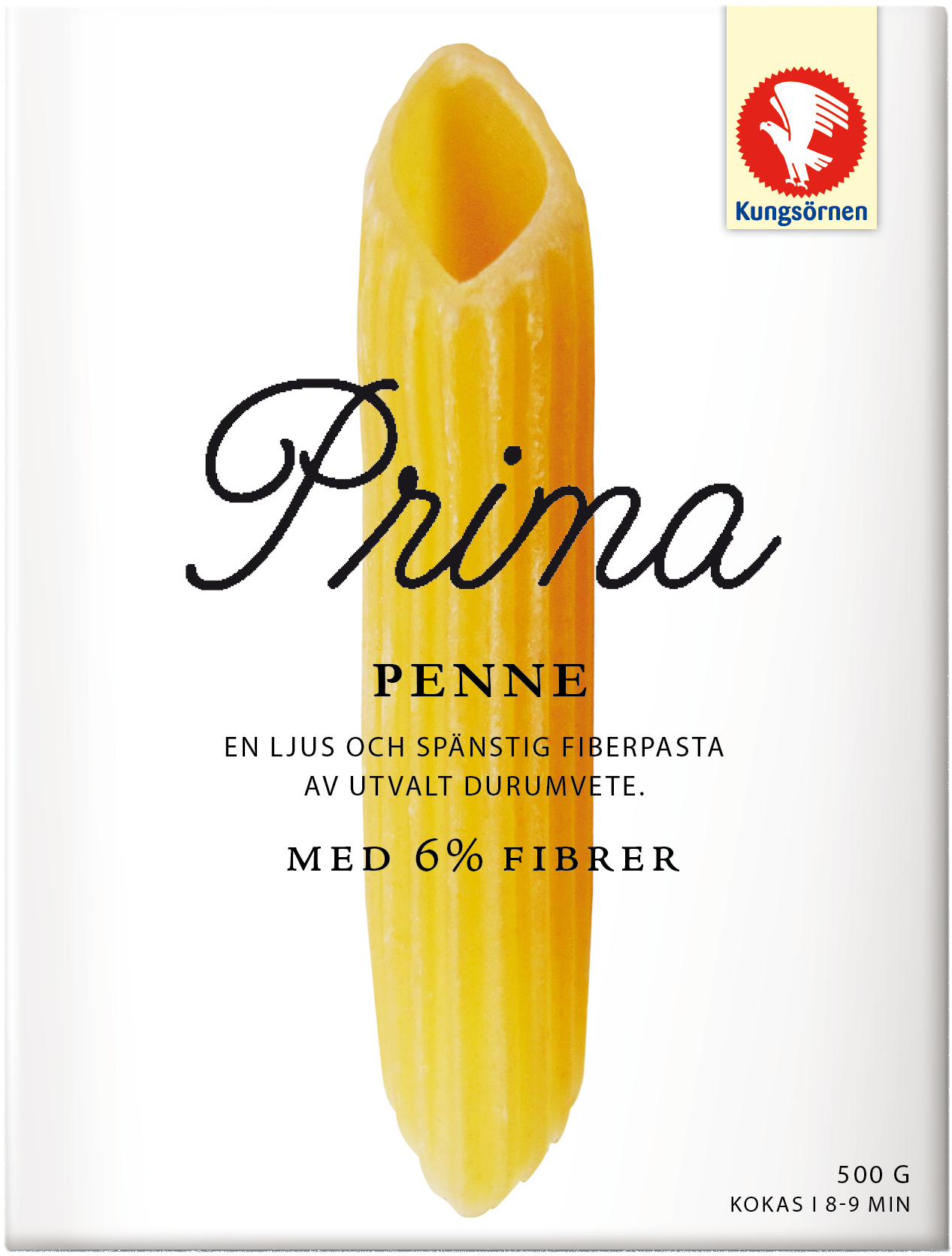
In this first version of our explorations, we wanted to make the product a hero and at the same time strengthen the quality perception of the brand. Through high-quality photographs, we highlight the pasta shapes into elegant sculptures. The imagery and the clean white background we believed would get attention and stand out well from the shelf.
In this first version of our explorations, we wanted to make the product a hero and at the same time strengthen the quality perception of the brand. Through high-quality photographs, we highlight the pasta shapes into elegant sculptures. The imagery and the clean white background we believed would get attention and stand out well from the shelf.



For the second exploration we had transparancy and craftmanship as our main themes. Both to communicate that Kungsörnen is a transparent and genuine brand but also to portray the product in a naked, but at the same time, beautiful way. We used a naturalistic photo of the product printed as an image on the outside of the box to get a see through effect.
By using the color red, we continue to build on the color world of Kungsörnen. We used typography to reinforce the perception of craftmanship in a small-scale-farm-production-type of way. We belive this design would both gain strong attention as well as Brand recognition.
By using the color red, we continue to build on the color world of Kungsörnen. We used typography to reinforce the perception of craftmanship in a small-scale-farm-production-type of way. We belive this design would both gain strong attention as well as Brand recognition.


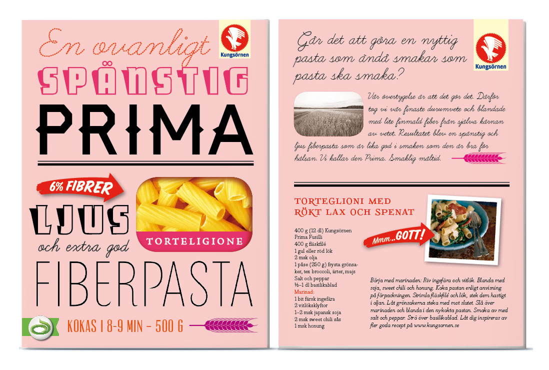
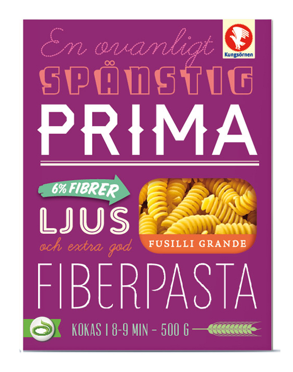
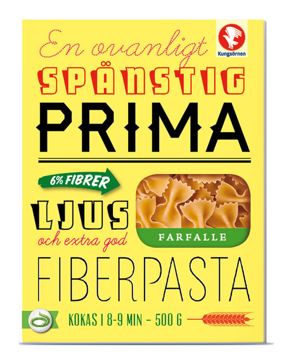
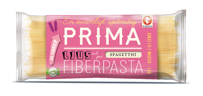
Our last exploration revolved around an unpretentious and inviting playfulness. We wanted to reconnect to Kungsörnen's heritage as being Sweden's foremost and most popular family pasta. Vivid colors for playfulness and attention and playful typography to communicate with a personal and friendly voice.
